May 20
The Rolex Coronet: A Logo's Story


There are only a few things that regular people genuinely understand about watches just as well as the experts do, and that is the quality of a Rolex timepiece. What has allowed them to become so easily understood by the greater public, that other brands don’t have? Is it merely that they make better watches? Of course not. It is the universality of the Rolex logo and what it stands for – the Rolex Coronet. Long seen at sporting events and on the dials of expensive watches glistening on the wrists of presidents and winners like Jack Nicklaus or Roger Federer. The Rolex logo has become a symbol for what we can achieve when we put our minds to it, and that story resonates with us all – whether we love watches or know nothing about them. This is the story of the Rolex logo, how it came to be and what it has turned into today.
Early Days
Founded in 1905 by a pair of brothers in law, Rolex was originally named after its co-founding duo, Hans Wilsdorf and Alfred Davis, as Wilsdorf and Davis. The company originally began by importing watch cases from Dennison and Swiss pocket watch movements from Aegler that they would then assemble and stamp with “W&D” to be sold in jewellers. It wasn’t until three years later in 1908 that the name “Rolex” itself was trademarked as a brand name for their watches. Seven years after this, the company was officially renamed as “Rolex Watch Co. Ltd” in 1915. In 1919 post-war Britain taxation on luxury items was rather high. To avoid this, Rolex was moved to Geneva where it has remained to this day. The following year, in 1920, the brand was renamed “Montres Rolex S.A.” which eventually changed to “Rolex S.A.” which is what we know it as today.
Developing the Brand
Like any company, Rolex had to develop its own sense of brand identity in order to differentiate themselves from other watch manufactures. At the time, it was often the case that brands would use third party dials and parts and only branded their case backs. To help with this, Wilsdorf and Davis designed the Rolex logo, the coronet, and registered it as a trademark in 1925. This coronet was to sit on the dials of all Rolex watches so the wearer could proudly display that their watch was a Rolex. Rolex had already won some precision awards from Kew Observatory which allowed them to become known for their quality timepieces.
Where did the word Rolex come from?
Like most logos, the Rolex logo began with the name of the brand itself. It is often told that the word was made up by Wilsdorf after he had gone through the alphabet arranging letters and decided upon Rolex as it is symmetrical, small enough to fit onto a dial and can be easily pronounced. Some stories even go as far as to say that a genie whispered the word into the ear of Wilsdorf after he had failed to come up with a name himself the night before. Admittedly, we’re not entirely sure where the word Rolex came from, but it makes for an interesting story all the same.
How has the Rolex logo evolved?
With Rolex being as secretive about their things as they are, it is only natural that we would want to know what the Rolex crown itself means. Typically, it is believed to symbolise a human hand, or five tree branches topped with pearls. Either way, Rolex has neither confirmed nor denied any speculation about what the Rolex logo symbolises and these are probably unnecessarily complicated. We can, for certain, see how the Rolex logo has evolved through time on their watches, in their advertisements and their marketing material.

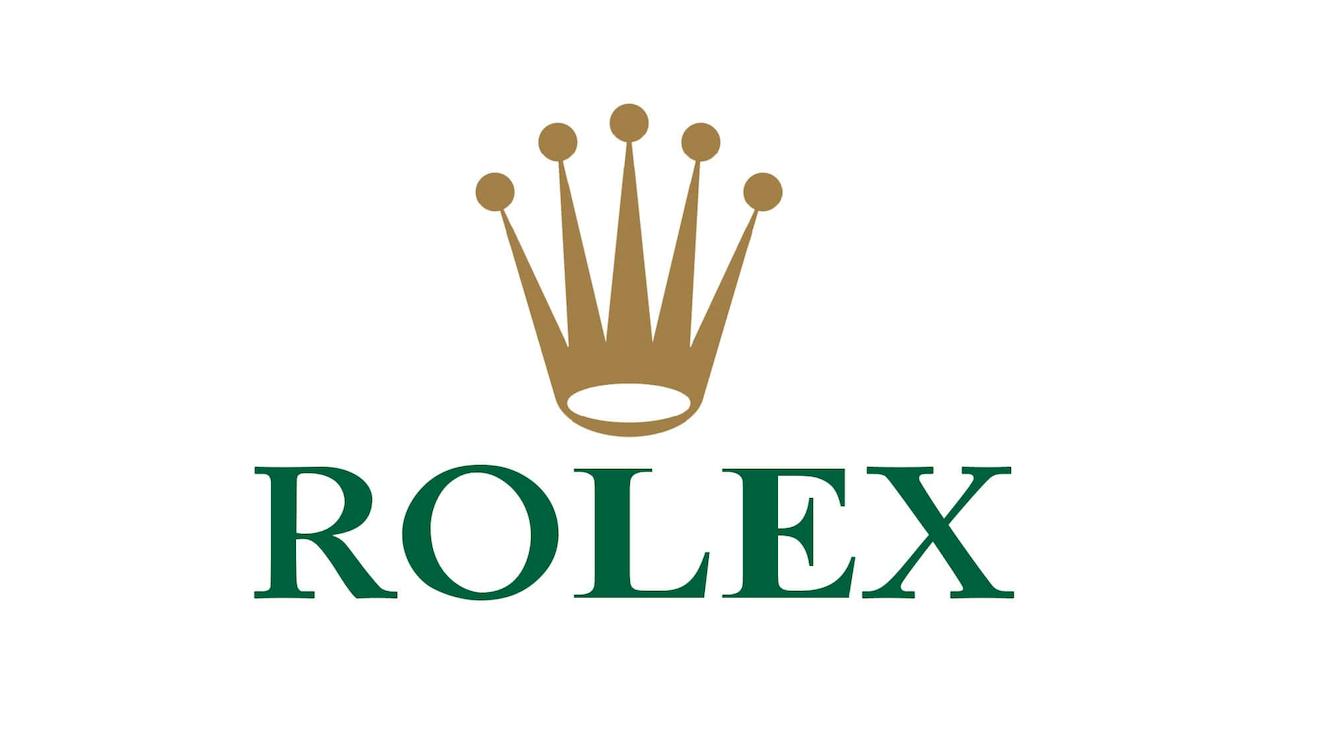
There have been three main stages of the Rolex logo. From 1908 to around the early 1950s, Rolex only used the word itself in their branding. The Rolex coronet did not appear in branding or marketing, but it did appear on the dials of watches. The exact shape the crown has taken has always been changing. From the original short and wide crown to the long and elegant shape it has now, the crown itself has continuously been updated. In the early 1950s Rolex added the crown to their advertising, sitting atop the word “Rolex”. This gave rise to the modern logo that we know today. This logo was only in black, however. It was changed then again in 1965 when the crown was made gold, to symbolise luxury, royalty and the precious metals in Rolex watches and the word itself was made green, to symbolise wealth and ambition. In the early 2000’s – around 2002, the Rolex logo was sharpened and made more crisp as the colours became more pronounced.
No matter how often Rolex update their logo, one thing is always going to remain constant, and that is that the Rolex logo will always be “A Crown for Every Achievement”.

May 20
All postsFeatured Posts

December 14
What to Buy as a Christmas Gift This Year (For Watch Collectors)

November 13
Cartier Santos 100 XL: The Path to New Heights

March 27